 BALA.WORK
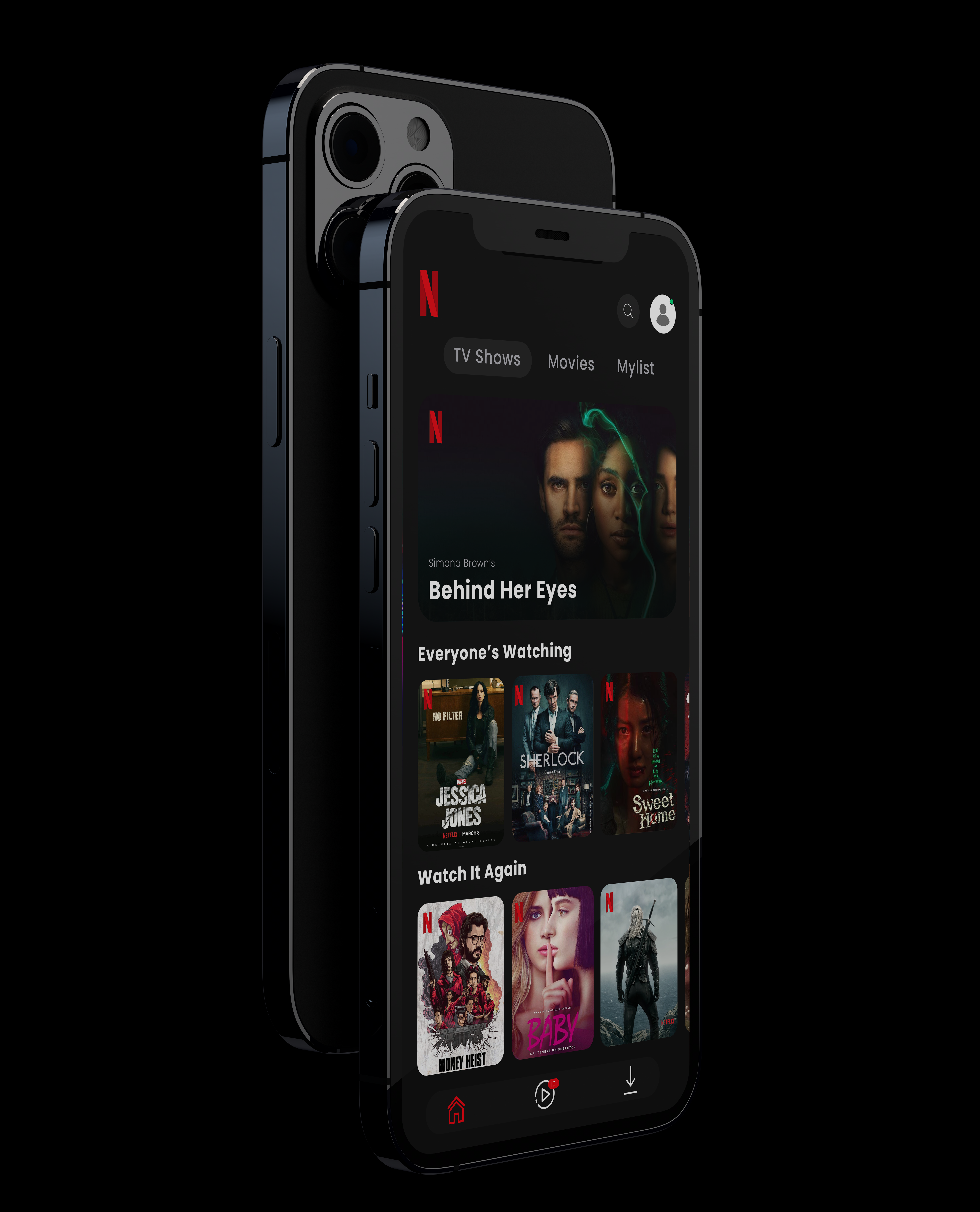
A creative concept exploring what a Netflix–IBM co-branded experience would look like - merging Netflix's bold, content-first visual identity with IBM's precision, grid, and data-forward design principles.
My role: UI/Concept Designer · 2024 · 1 week
The starting point
Brand collision exercises force designers to solve a fundamental tension: how do you honor two opposing design philosophies in a single coherent interface?
Finding the idea
Identified the common ground - both brands are authoritative, data-rich, and tech-forward. Built from that intersection, using Netflix's dark palette and drama with IBM's structured grid and typeface discipline.
Making it real
A unified UI that speaks both languages simultaneously - dramatic content display with enterprise-grade information architecture underneath.
The work
What came together
- Concept UI successfully merges two distinct brand systems
- Approved visual language for both brand identities maintained
- Demonstrates adaptive design thinking across brand contexts